4 Lessons from Spending $4556.89 Building Landing Pages Converting at 49%
A landing page is an important step that starts the customer journey where a new lead first gives you permission to start talking to them.
For a Kickstarter it’s a crucial step of teasing cold traffic with an enticing new product and promising to send more info WITH A HUGE DISCOUNT when the product releases.
This is the “List Building” angle of Kickstarter where businesses build awareness and hype around their soon to be released product so that when they launch the Kickstarter there’s tons of eager customers waiting to buy.
Obviously the better the landing page, the more people sign up, the more Kickstarter sales.
For The Guide Kickstarter we used four different landing pages, each better than the last.
Landing Page #1 suckedddddd
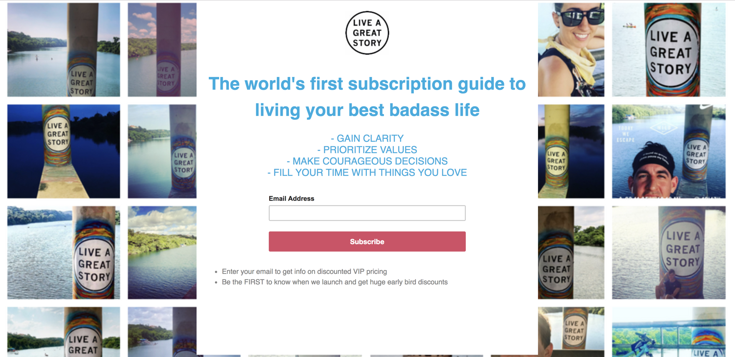
I built it on Mailchimp because that was the quickest resource. We already use Mailchimp and they recently released the option of building a landing page so I figured I’d try it out.
Here’s what it looked like:
It was absolutely hideous and performed terribly, converting at a whopping 5.6% conversion rate.
I knew it sucked. It was ugly af. I personally would not have given my email address. But it was the first step needed to get the ball rolling.
Lesson 1 : Just start. Put the pen to paper and start. It’s going to suck but you’ll actually have something to improve. You can’t improve something that doesn’t exist.
I knew we couldn’t spend money sending people to a landing page that converted at 5% or we’d be flushing money down the toilet, so I had to make a change.
At this point I also realized Mailchimp doesn’t have FB pixel optimization so we were just sending traffic objectives without being able to optimize for any sort of conversion meaning we spent $1300 blind. That “per purchase” was just “clicks” 🤦🏻♂️
That’s when I moved to Leadpages
LeadPages makes it super simple to build a beautiful landing page AND it has Facebook Pixel options which was big.
The other option is Click Funnels but I’d used Click Funnels before and it wasn’t as “out-of-the-box” as LeadPages.
Landing Page #2 was better and took hardly any work
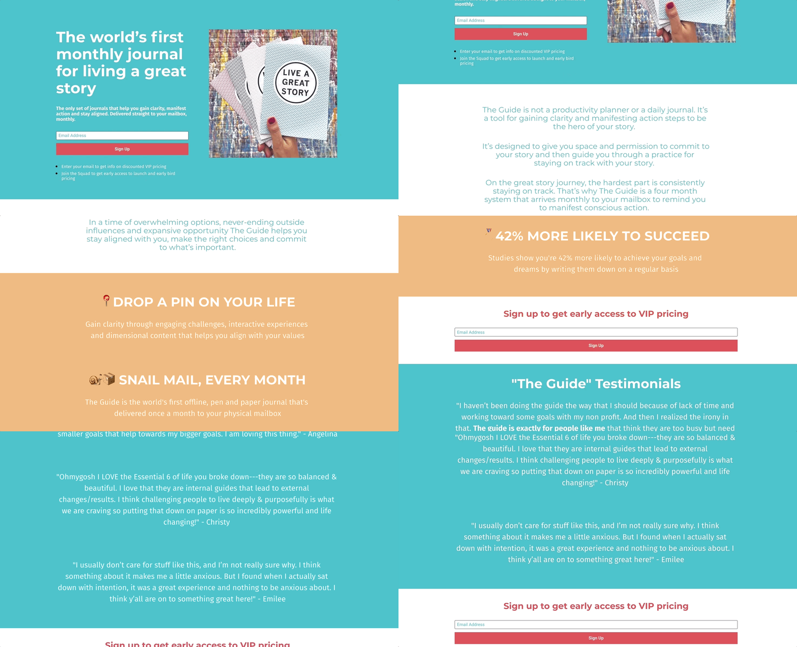
This design was a template on Leadpages and since The Guide is a pen and paper item I thought it was a good next step.
Switching to this style automatically doubled conversion! But 10% still sucks.
One thing I started once on Leadpages “A/B testing” which means making little changes to the style of the page to see which performs better.
The page above (the best performing) was a long form page with more details. Another was a shorter version with this same aggressive headline. Another was a more passive tone.
Lesson 2 : A/B Test everything. Doing what you “think” might work, won’t. You need data to make data driven decisions and A/B testing gives you solid data for understanding how to make better decisions.
Here’s the results:
But 10% still sucks so I had to make another change.
THIS IS WHERE I MADE A BIG MISTAKE!!
With this next landing page I moved from “product focused” to “community focused”
I moved from “Buy The Guide” to “Join the Community”.
My thinking was that if we invited people into “the community of like minded people” that it was a good first layer of the funnel and then we could slowly drip them down the funnel and eventually convince them to buy The Guide.
Lesson 3 : Remember why you’re getting leads. Our focus switched from “people interested in buying The Guide” to “people who want to join the LIVE Squad community” which was a big mistake.
Who DOESN’T want to join an inspiring community of like-minded people wanting to make an impact? Exactly. Now how many people want to actually spend money? Exactly
Unfortunately this is where there was a detour from the original logic and even more unfortunately the numbers supported this detour.
This “Join the Squad” page was converting at 44%
Then we A/B tested and this one did even better.
And then we A/B tested again with “Be the Hero of Your Story” title and that one was up to 49%!!
49% conversion rate, that’s pretty damn good. That means HALF the people who visited gave us their email
*For the doubters : we ended up sending more traffic to the top performing “C” page so there was more traffic data, I just don’t have screenshots
We were still spending too much “per purchase” because the goal is to get an email for around $1 and we were spending around $1.50 average for purchase but that was at a 50% conversion so emails were actually costing around $3, which is high.
AND THAT WAS FOR COMMUNITY! That was NOT for buying The Guide which was our ultimate goal.
Lessons 4 : It’s not always about per lead cost. Yes this is crucial but when I focused toooo much on getting that lead cost under $1 I lost track of the real objective, which was collecting qualified leads.
Ultimately this is where we switched directions from “landing pages" to “Facebook Messenger”
This page still stayed up during the whole campaign resulting in a 29% conversion which is still pretty good.
Around this time was the ManyChat conference and that’s where I was enticed by the analytics of Facebook Messenger. I made the decision to swerve to full FB Messenger Marketing instead of Landing Page Email collection, which resulted in a whole bunch of other learning lessons.
Want to chat more about the landing page optimization process? Send me a message


